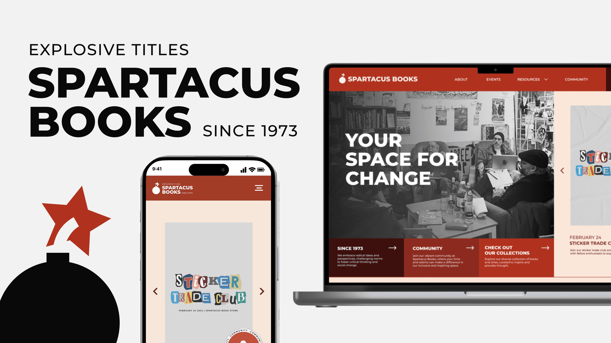
Spartacus Books
Helping a 50-year-old Vancouver bookstore bring its community online.
Team
Ana Rodriguez
Aoi Netsu
Daianne Malabanan
My role
User Research
Wireframing
Prototyping
Tools
Figma
Duration
5-day hackathon
Overview
A digital home for a bookstore that's been a community hub since 1973.
In five days, our team of four designed a brand style guide and a new site for Spartacus Books, an independent Vancouver bookstore.
Problem
The website sold books. The store builds community.
Events were hard to find, books had no categories, and the site read as a plain storefront.
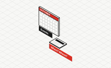
Events were hard to find
Readings, open mics and workshops are the heart of the shop, but upcoming events weren't clearly displayed.
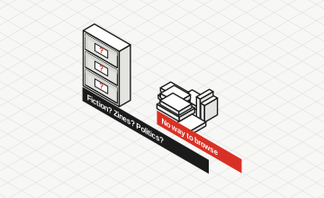
No way to browse
Books had no categories, so readers couldn't wander the shelves the way they do in the store.
Read as a plain storefront
The site felt like a shop, not the community space the physical store has been since 1973.
Discovery
Who actually visits?
Interviews turned up two kinds of visitor: Community Explorers, here for events, and Intentional Visitors, who just want quick updates. Three insights followed:
- 1
Events are the heart of the shop
Readings, open mics and workshops bring people in, but upcoming events weren't clearly shown online.
- 2
Readers want to wander the shelves, online too
Books had no categories, so readers couldn't browse the way they do in the store.
- 3
It's a community space that happens to sell books
Community Explorers come for events and connection; Intentional Visitors just want quick updates.
Design decisions
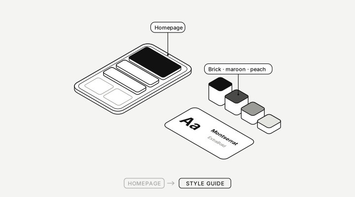
Events lead the homepageSolves 1
Upcoming events open the site in a carousel, each with its date.
A space for changeSolves 3
Right under the events: the store's history, its community and its collections.
Books and resources one tap awaySolves 2
The menu groups Books, Content Library and Services, and the homepage recommends books by topic.
One look for every pageSolves 3
A style guide of brick red, maroon and peach, bold Montserrat and the Community stamp.
Challenges
Agreeing on what Spartacus is.
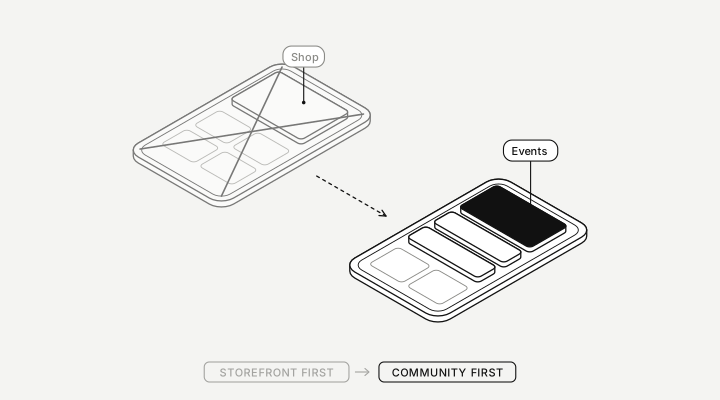
Our first instinct was a shop with an events page. Interviews pulled us toward community first, and the team had to let go of a storefront-led homepage to get there.
Result
A style guide and a mobile-first site, in five days.
Events now open the homepage, the store's history and community have a home, and books and resources sit one tap from the menu.
Reflections
- Design is prioritization. Removing clutter made the experience stronger.
- Reframe before you design. Seeing it as community, not retail, changed every decision after.
Next steps
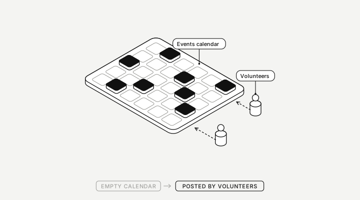
Make it easy for volunteers to keep it alive.
Spartacus is volunteer-run, so next I'd design a simple way to post events and staff picks without a designer, then test the homepage with regular visitors.
Thank you
To Ana, Aoi and Daianne.